Contents:
|
Pencil Drawings:
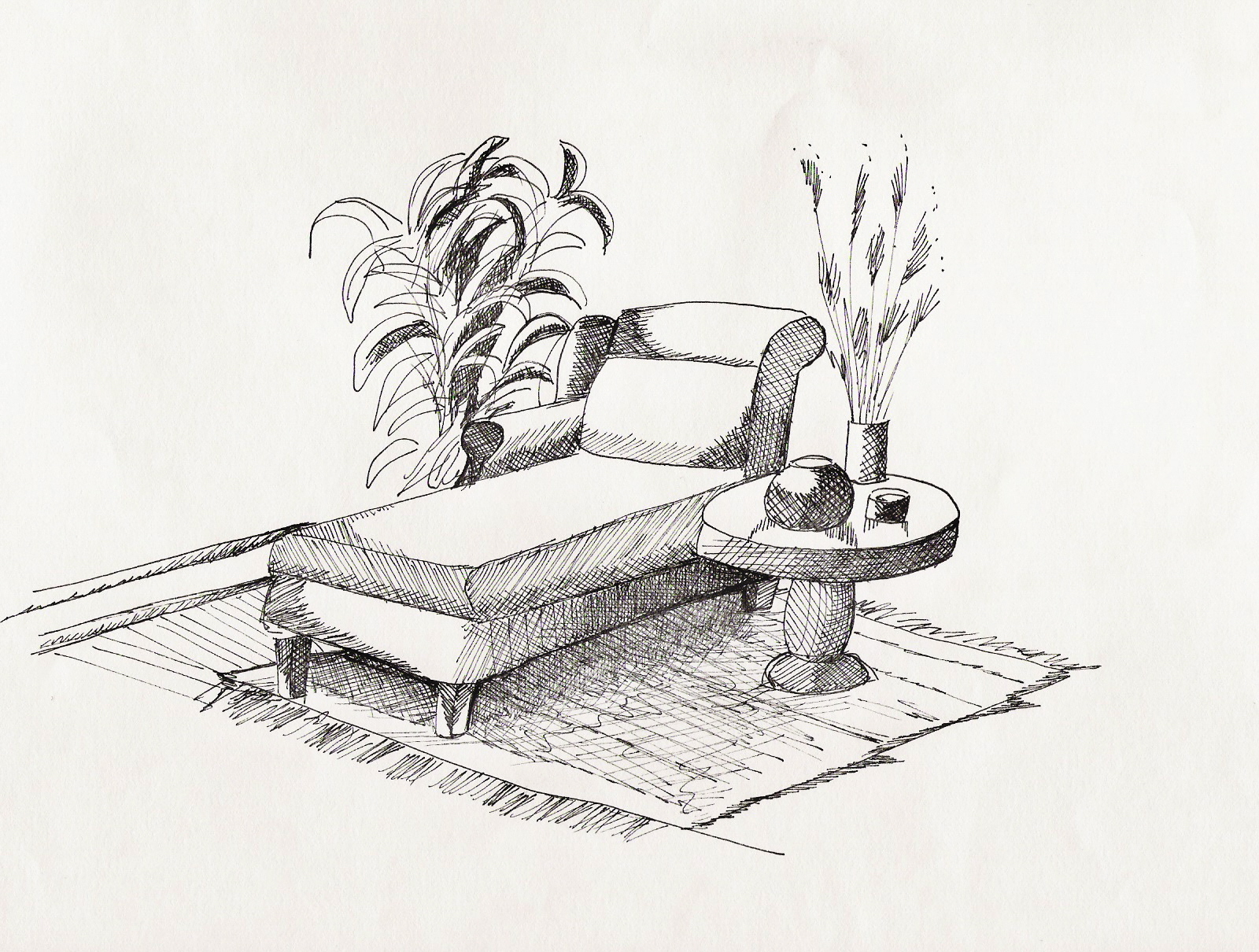
 This still-life drawing was done in pencil, in order to learn how to give dimension by shading with different pencil leads. | 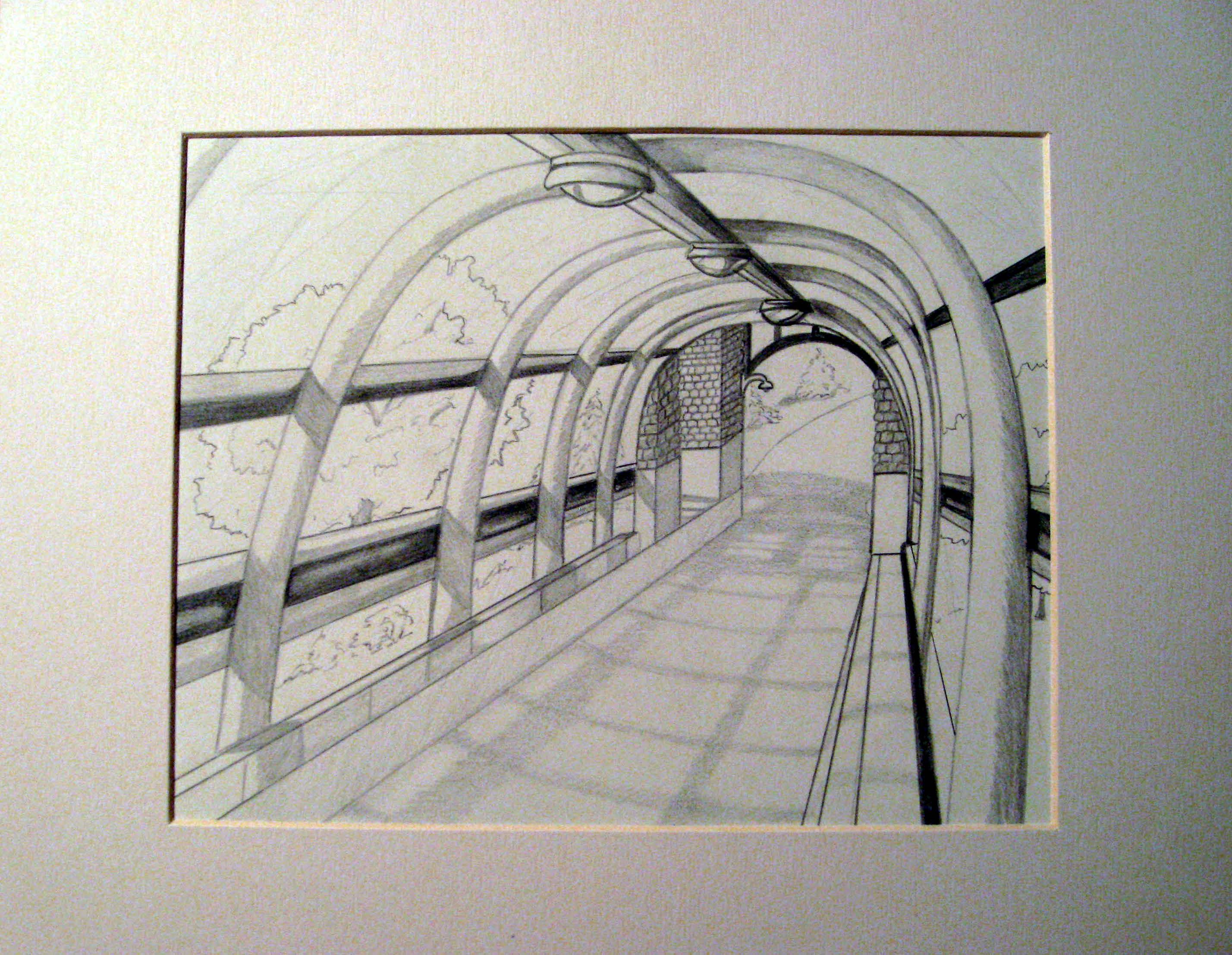 Also done in pencil, this is a perspective field drawing done inside our new bridgeway on campus at IPFW that connects the dorms to the main campus buildings. |
Ink Drawings:
 This picture was done with the use of black ink markers. By using different width marker tips and techniques like cross-hatching and dotting, I learned how to give the drawing softness even with the use of harsh markers. | 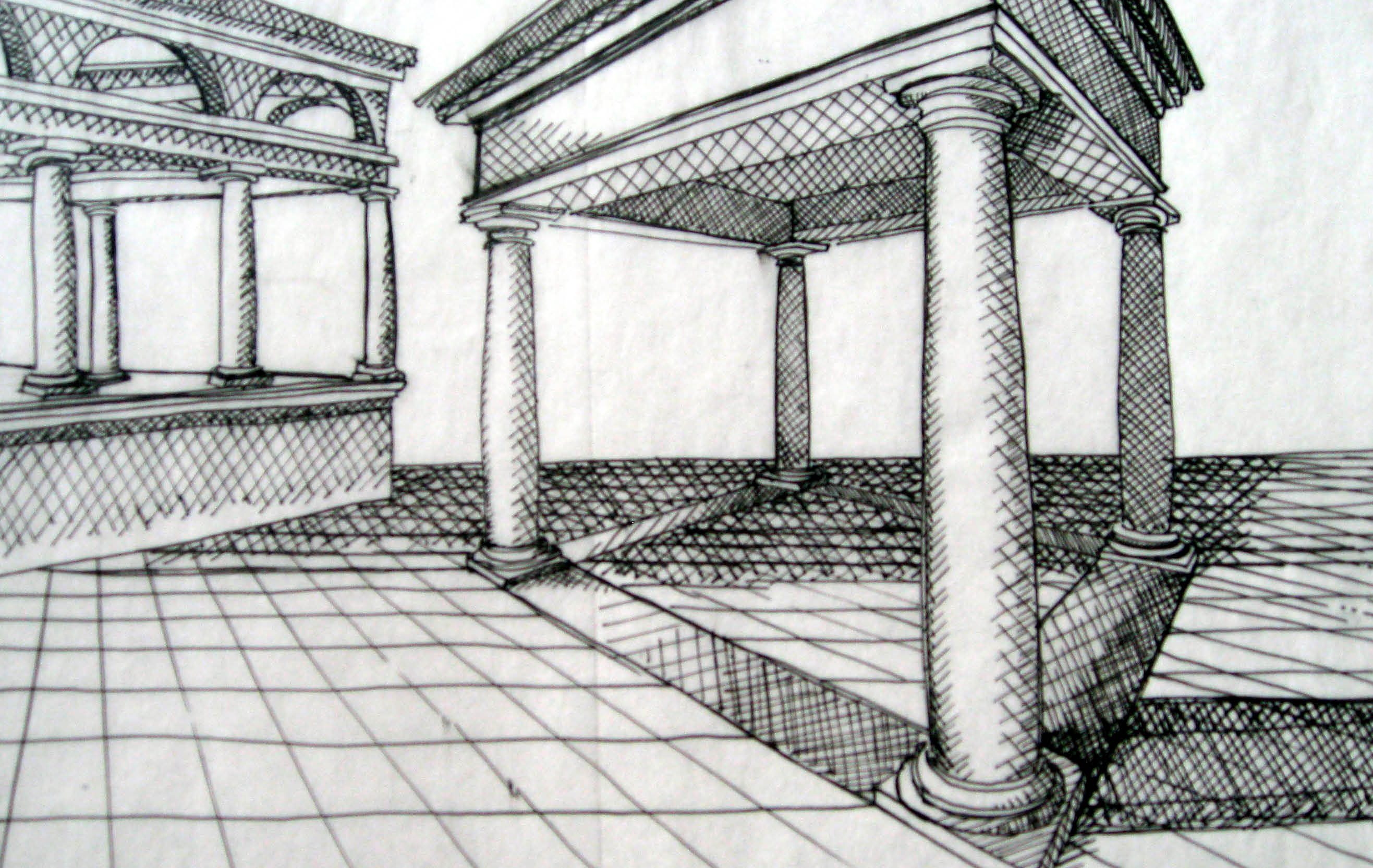 In order to expand on using ink as a drawing medium, we moved on to perspective drawing to practice drawing to scale and to continue using the proper line weights necessary. |
Color Marker Renderings:
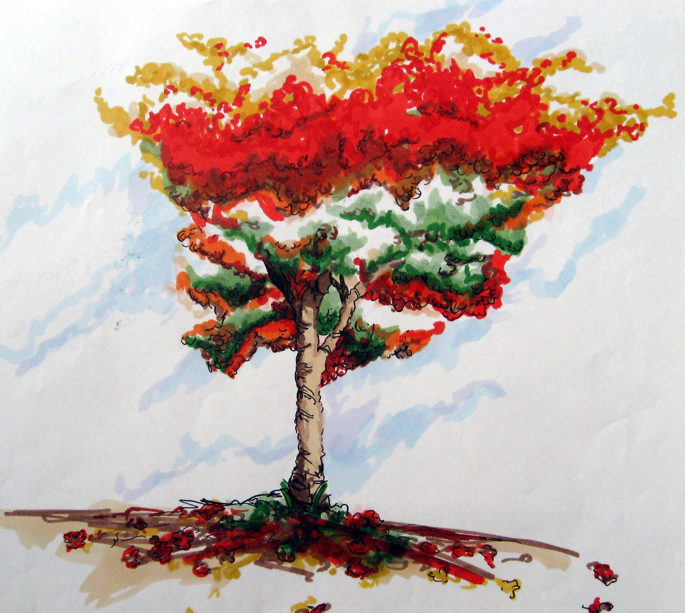 The next medium I was introduced to was color markers. I learned how to use the markers as a color wash and to give detailed realism by layering the markers along with black ink. | 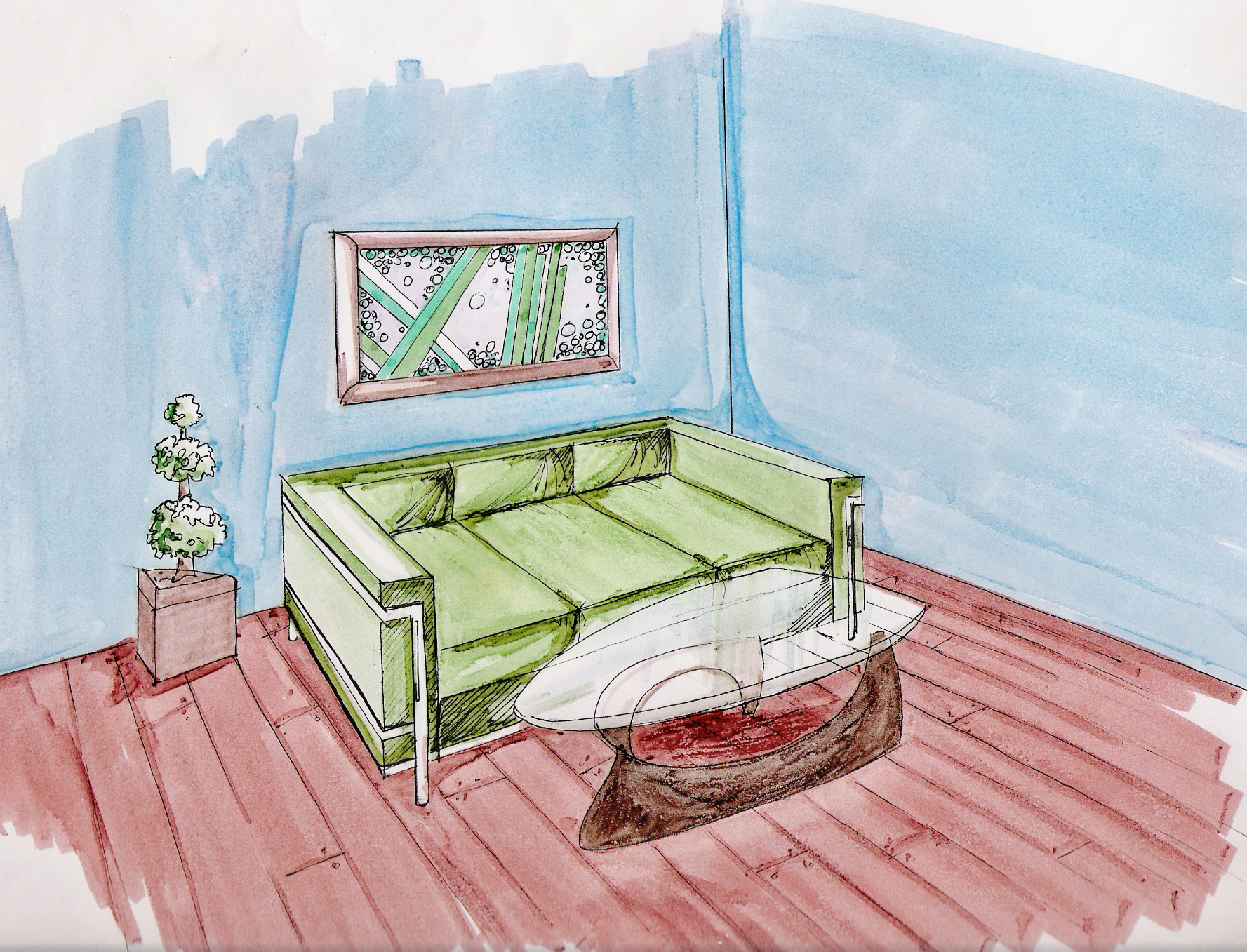 I built on the use of color markers and combined my perspecive drawing with the use of markers for my interior images. The use of color markers mixed with black ink became my favorite technique for a majority of my projects throughout my academic career. |
Grisaille Ink Drawings:
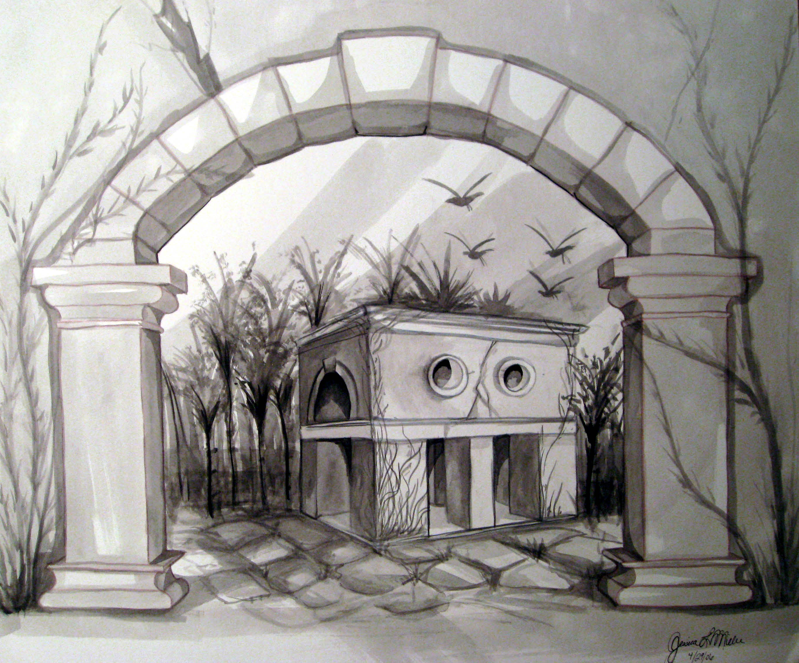 I built on the drawing techniques from my freshman year in these grisaille (ink) washes. The assignment was to create anything I wanted inside the arched gate. | 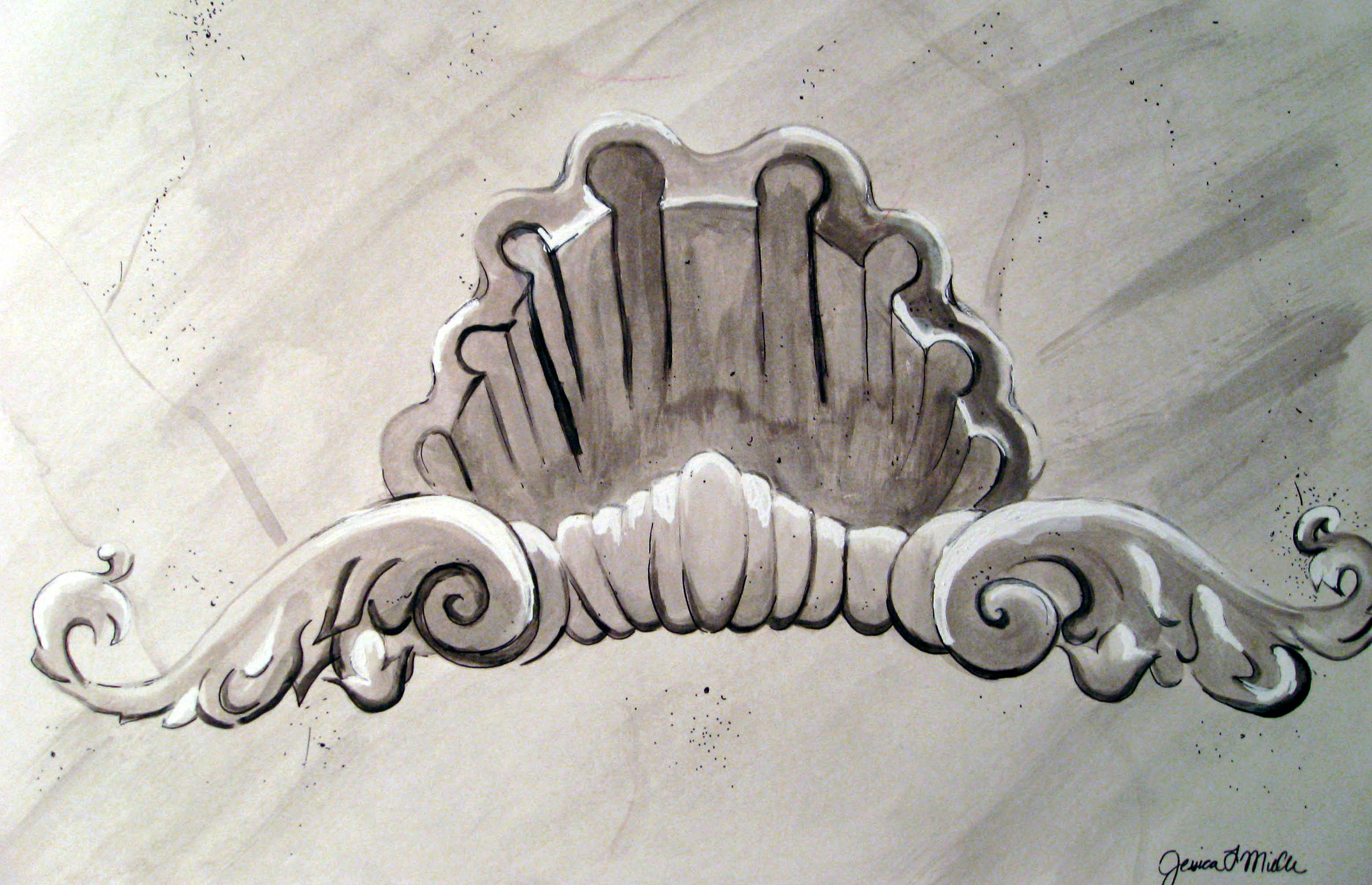 This second grisaille (ink) wash is a shell reminiscent of the architectural details in European history. In this wash, I learned how to achieve highlights with the use of white chalk to naturally lighten the points of direct light. |
AutoCAD Drawings:
|
|

The project labeled ARET-124 above was an assignment given where I had to complete the construction documents of the house plan given in class. We were able to design the layout, and had to visually represent our work in the drawings.
Residential Design Boards:
For this assignment, I was randomly given a famous interior designer to use for inspiration for this small living space. I was given the famous Carlton Varney; "The King of Color". The design had to be handicap accessible as well as reflect the design philosophies of our given designer.
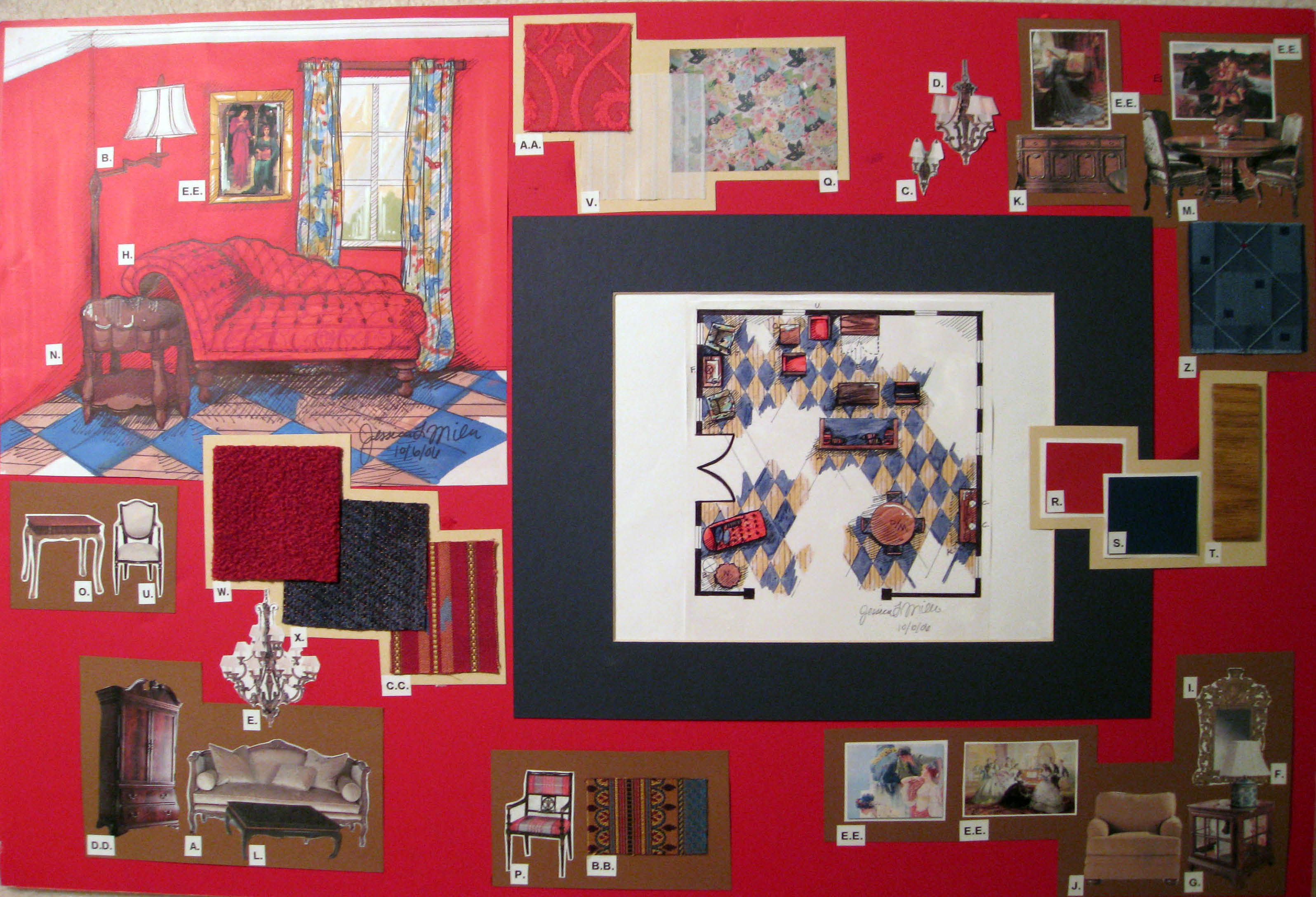
 Board #1- Living room and sunroom wall elevations with furniture and window treatment fabric choices. | 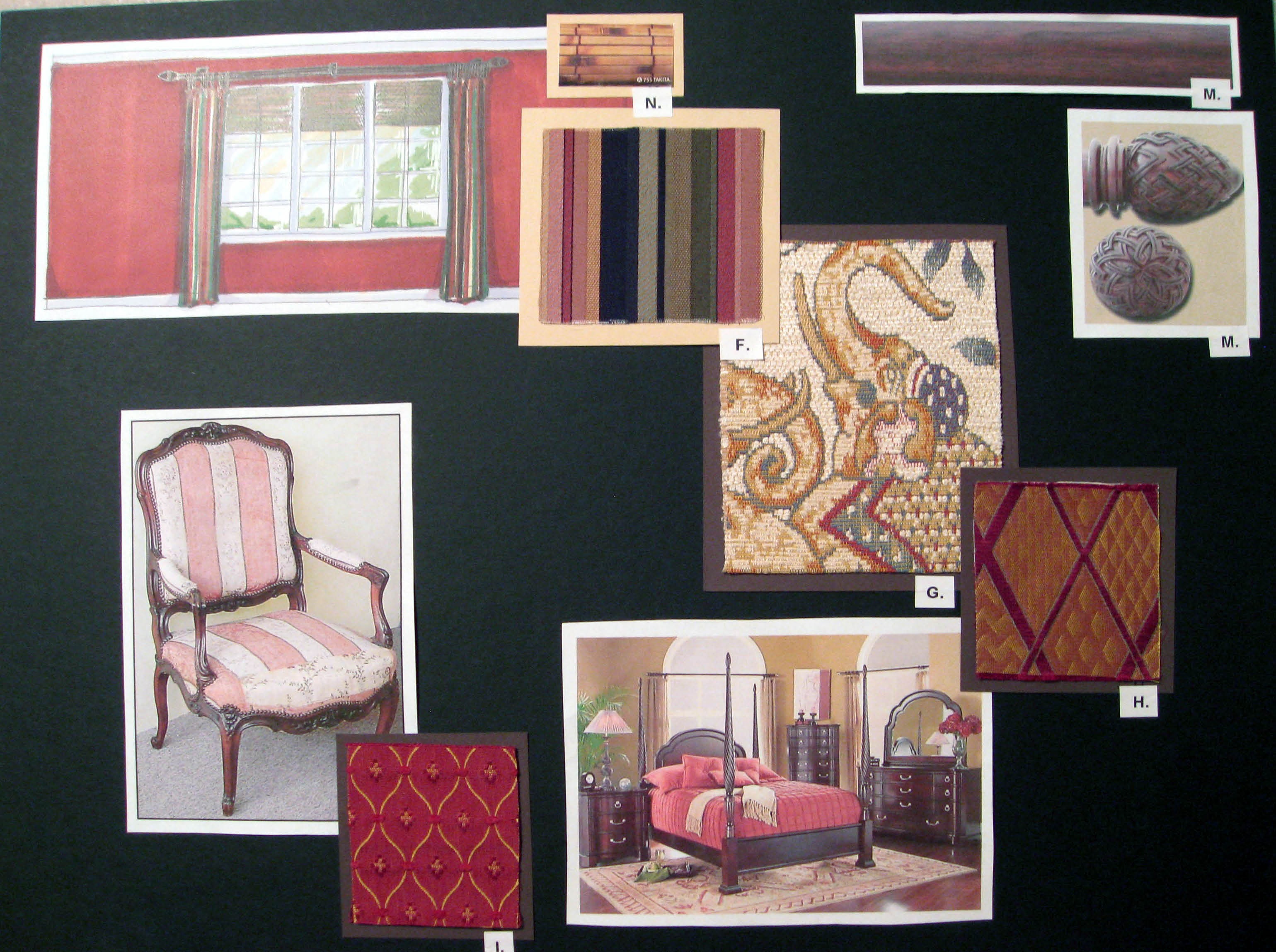 Board #2- Master bedroom wall elevation with fabrics made for a suite. Furniture and window treatment selections to match. |
I was given this floor plan, but we were to use someone close to us to interview for the fabric and color selection. I interviewed my parents for their living room, sun room, and master bedroom selections. I hand rendered the window elevations in the three rooms to scale to communicate the design intention.
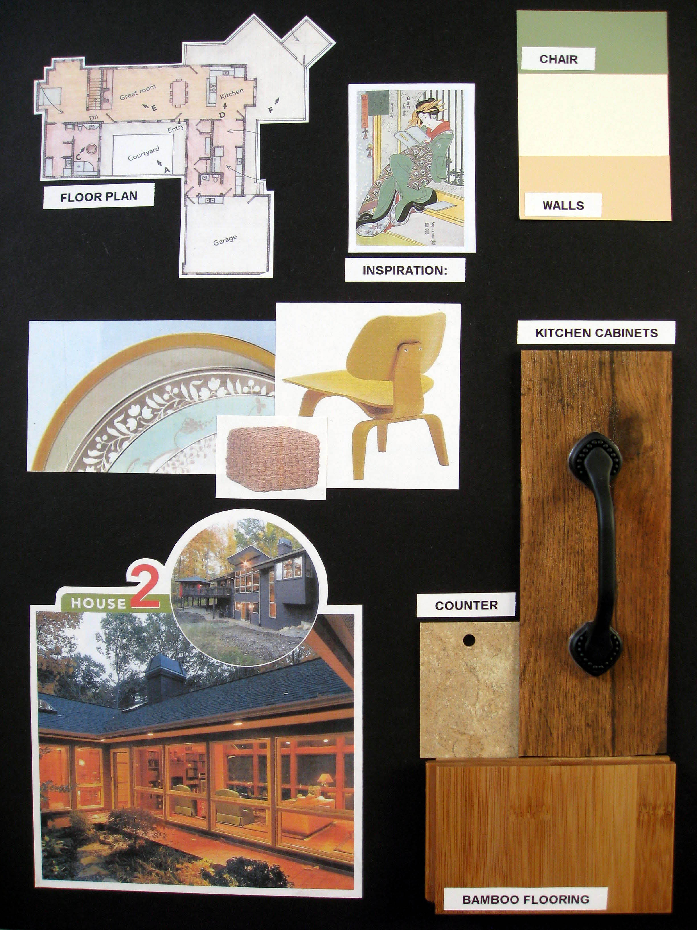 Board #1- Here are my paint, cabinet, flooring, and countertop selections. The owners had several items they wanted to encourperate, which are shown above. | 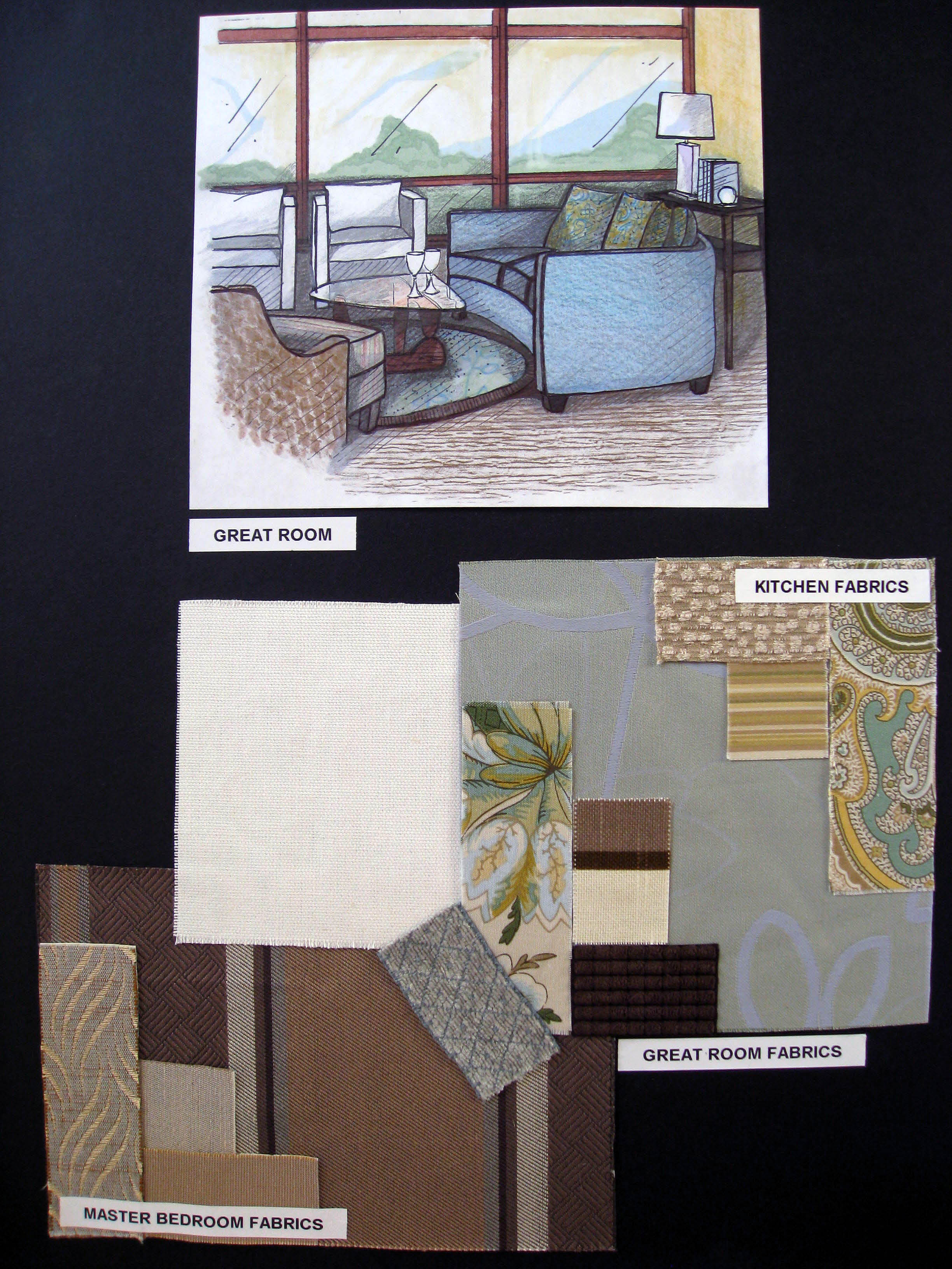 Board #2- The fabric selections are calming and cool to coordinate with my asian-themed inspiration. The perspective shown is of the great room. |
For this project I was to provide a schematic color scheme for a single-level Asian inspired modern home. (I hand rendered the scene to the right.) I used calming greens and blues with the chocolate brown as an accent throughout. The "Yin and Yang" were in complete harmony with these relaxing hues.
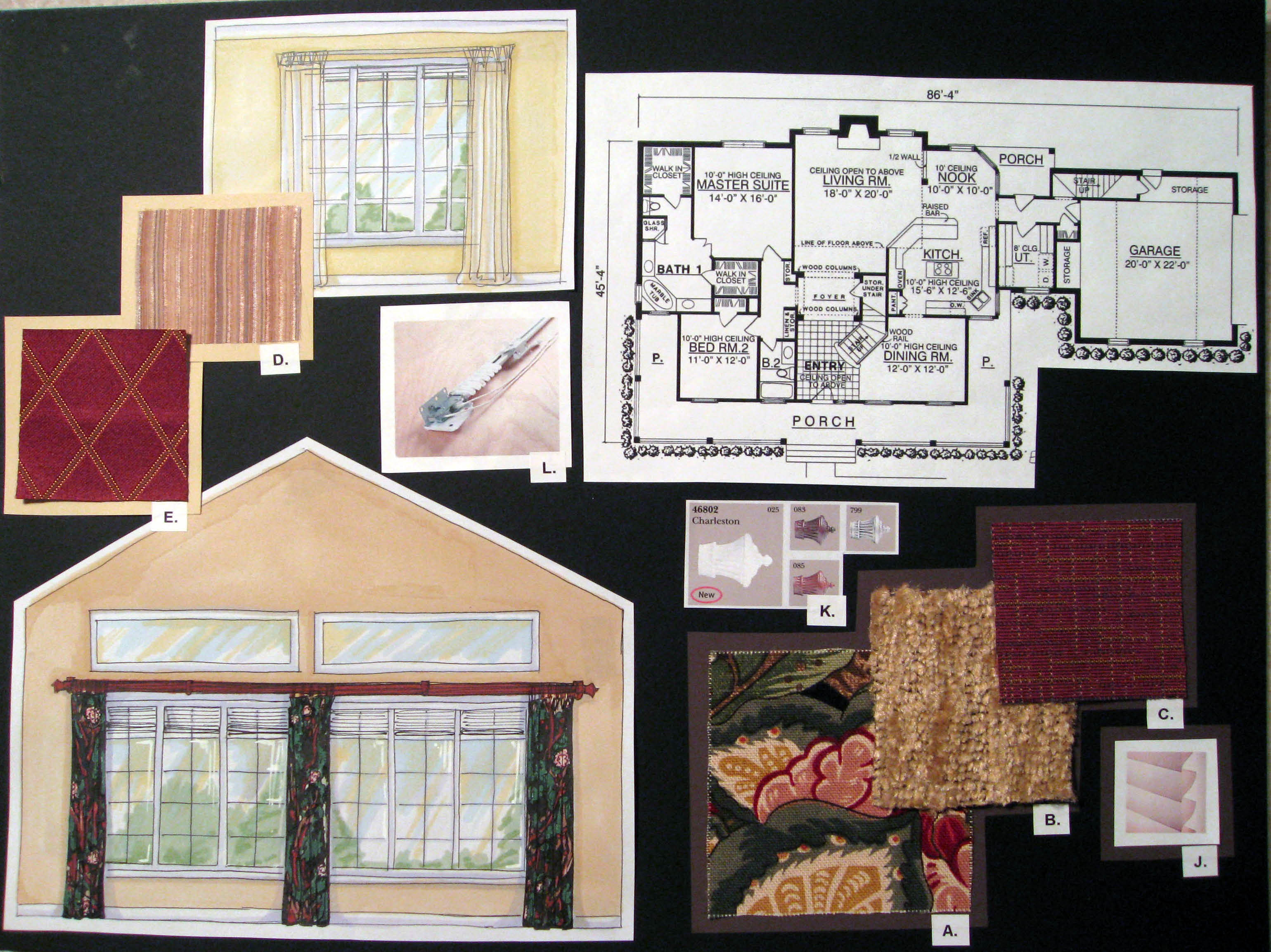
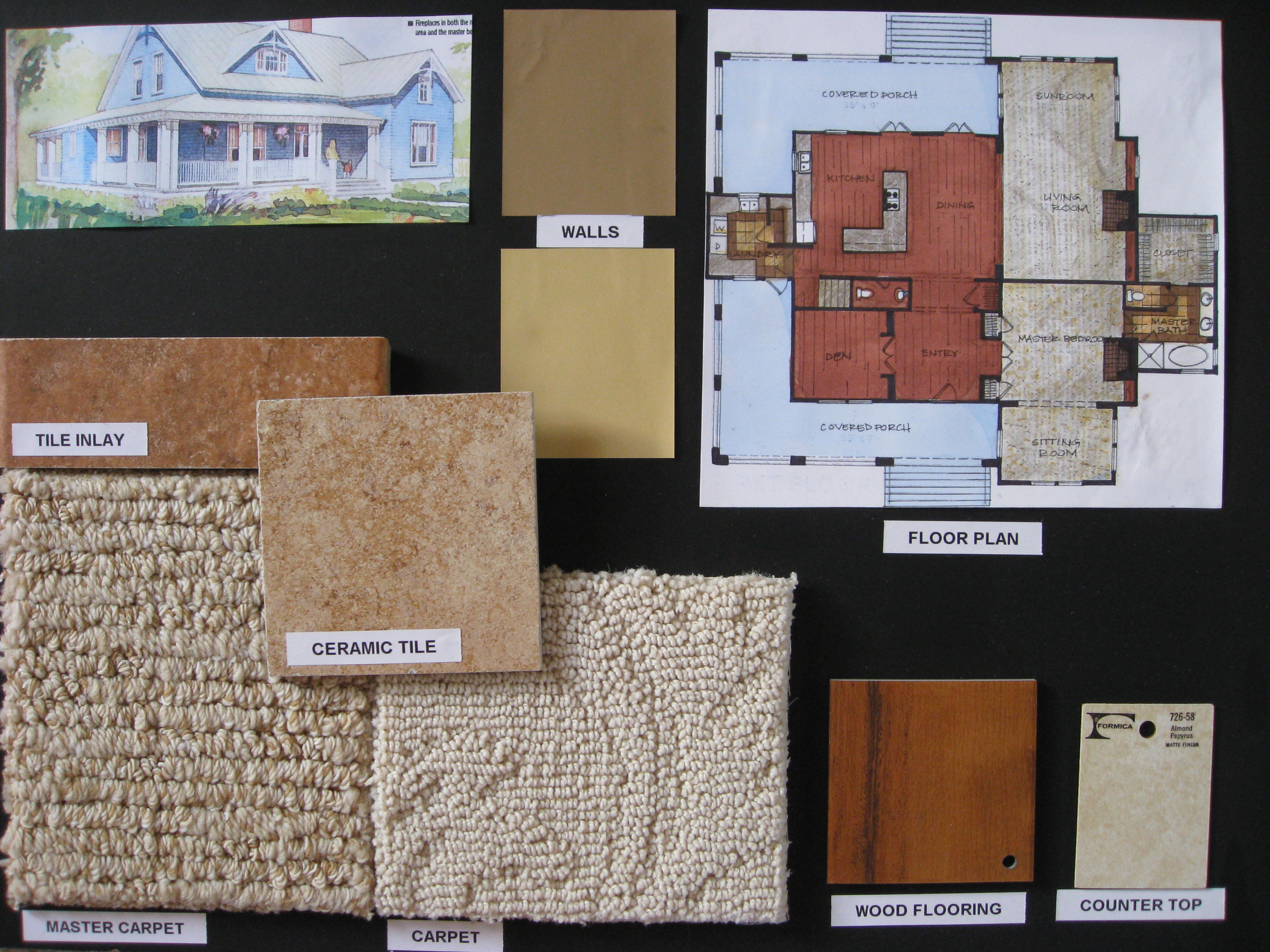 Board #1- Above is an exterior view of the house, along with a rendered floor plan. My selections were light and natural to co-exist in its environment. | 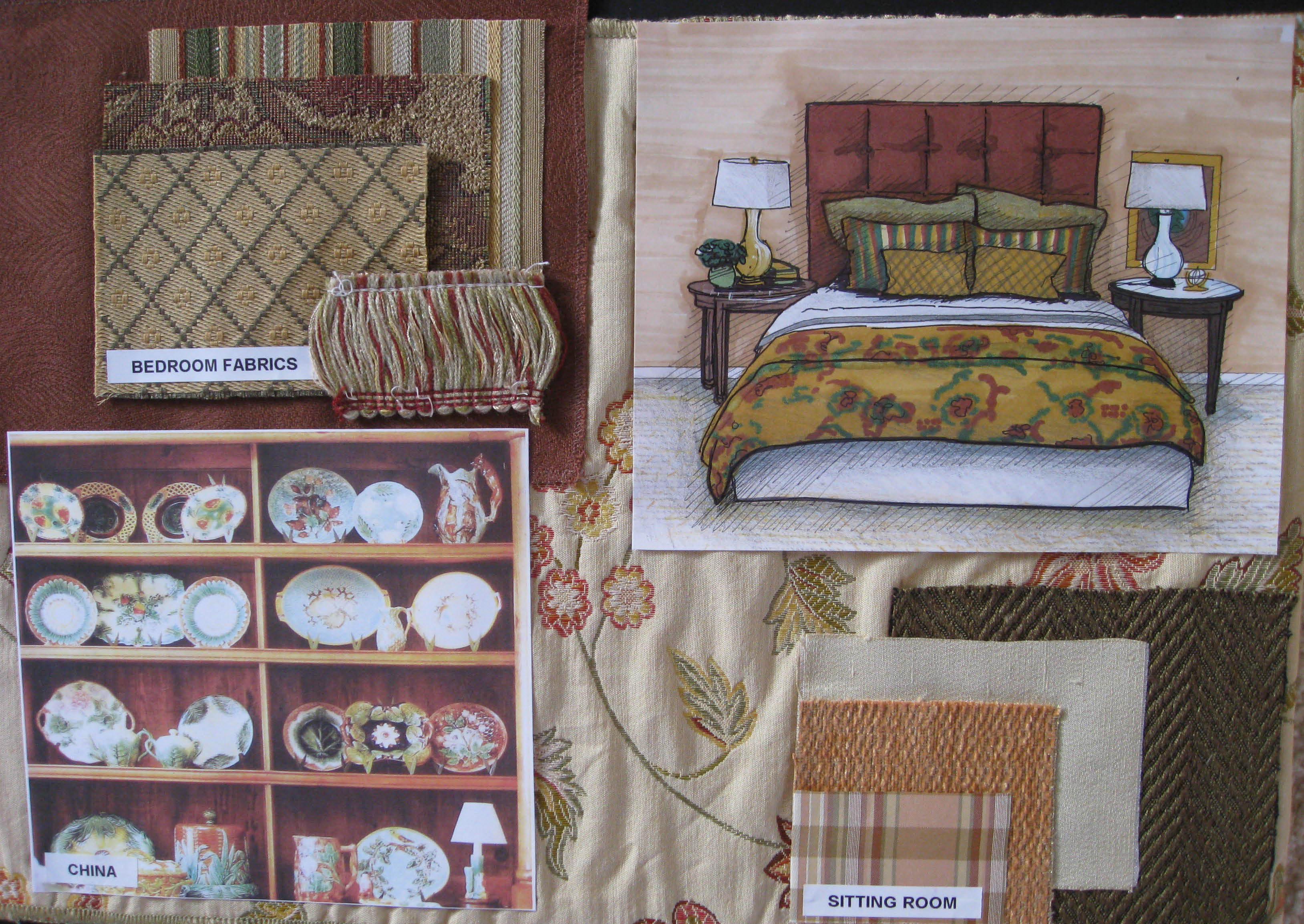 Board #2- Here I've shown the fabric selections for the master bedroom and their son's room. The perspective is of the master bedroom. |
This Tudor-style homeowner wanted a natural color scheme. I provided ideas for flooring and fabric choices. I color enhanced the floor plan and also hand rendered the image to the right. I used natural earth tones with a sky blue to appeal to the client. They hoped for a casual living space, so I gave them the comfort and casual elegance with the use of durable fabrics.
Commercial Design Boards:
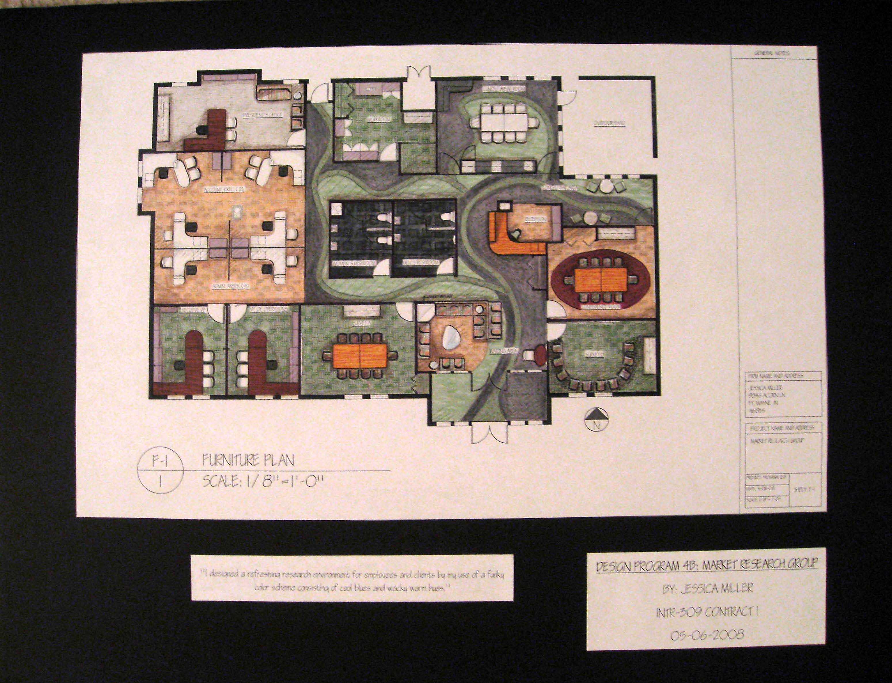 Board #1- This is the rendered floor plan to show the floor pattern design and overall layout. 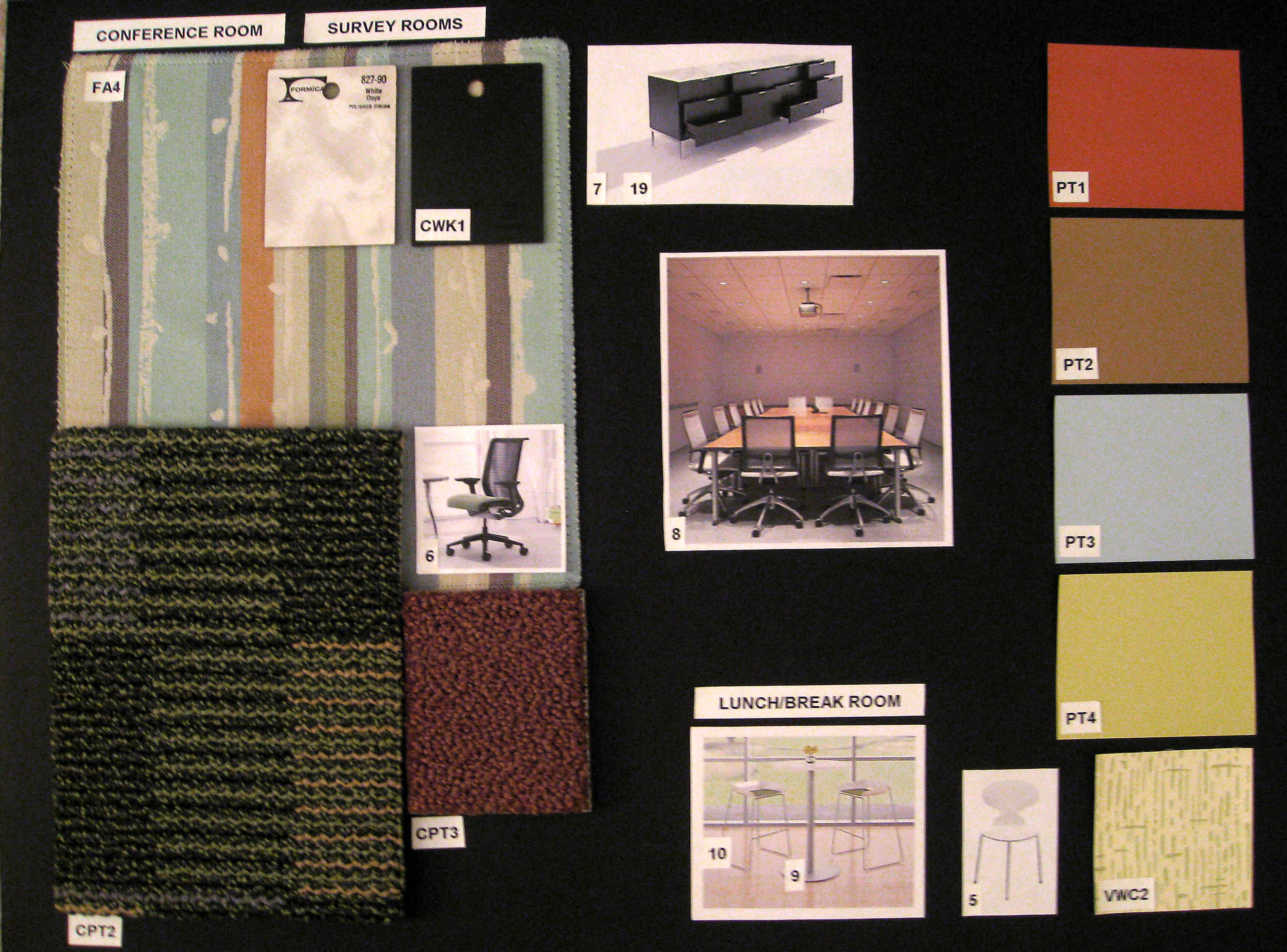 Board #3- This board is to represent the selections for the conference and meeting rooms. I used the interesting carpet and paint combinations to make the space lively and energetic. | 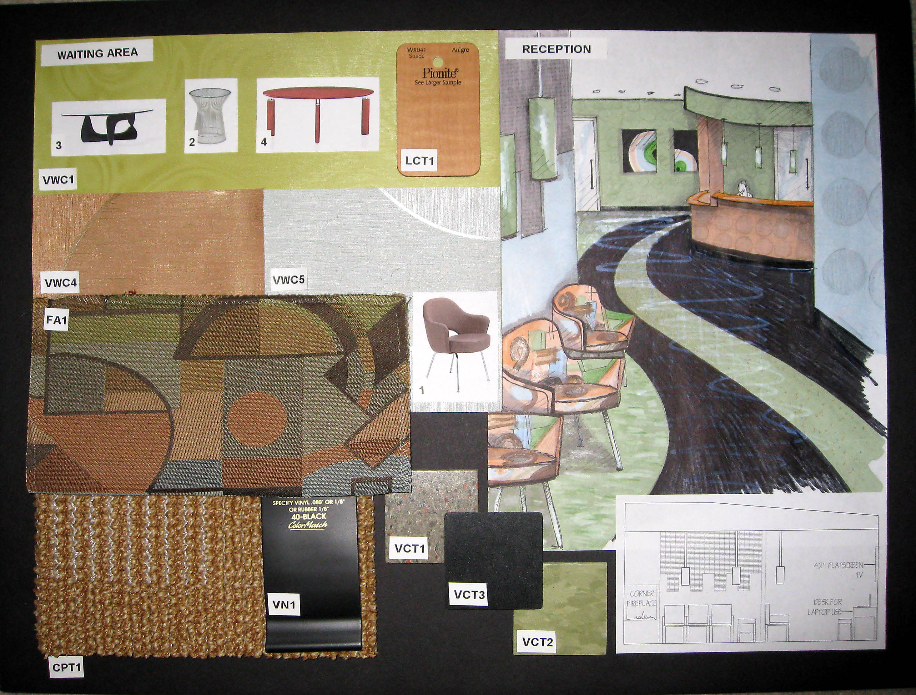 Board #2- Here are the finishes for the receptionist and waiting room consiting of rubber base, carpet, VCT, fabric, wall coverings, and casework laminate. 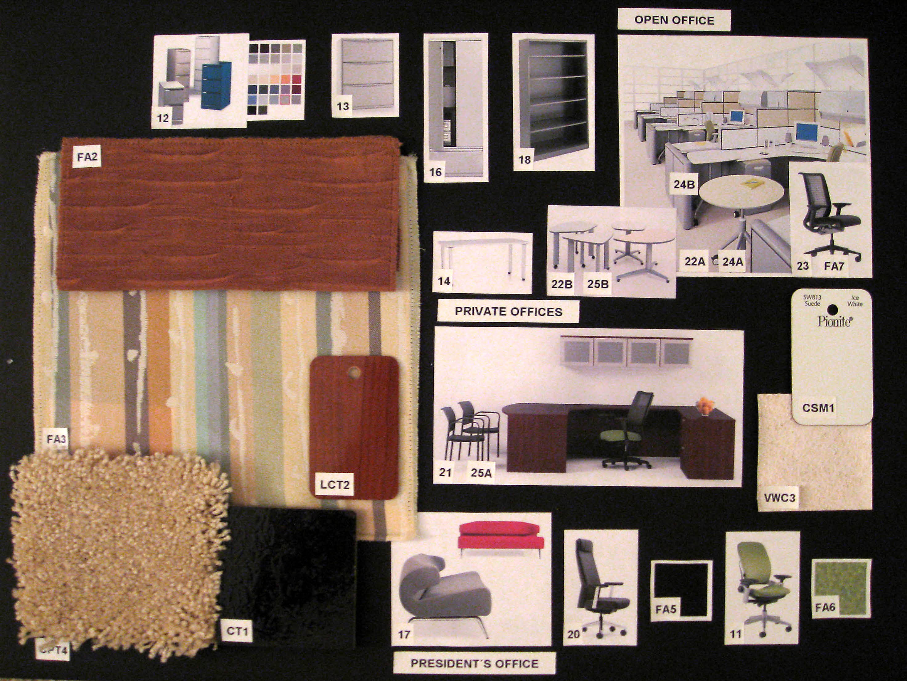 Board #4- Here I laid out the all the office spaces. The VP and President had more unique selections, and the systems furniture were for the account executives. |
This project was the design of a Market Research Office. We were given the shell and had to design the finishes of the entire office. I chose an energetic color scheme to enhance creativity in the workplace and to stimulate conversation in the conference and meeting rooms. This was one of the most fun projects I did and was also one of the most challenging. The floor plan had perameters and challenges for us to work around, but I think the placement of the conference room made my design unique becasue of the two entrances in and out to the receptionist and the breakroom.
This was a group project that incorporated the Moroccan style and design. As part of the group grade, I designed the floor plan of our restaurant. As a group, we researched the Moroccan culture and chose finishes to create the feeling of entering into another world. |
|